


Amany Store
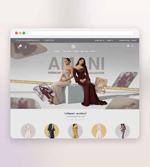
Fashion sells on image before it sells on specification, so Amany Store's homepage was built to work like a lookbook first and a catalogue second — full-bleed imagery and a considered rhythm that sets the tone of the collection before a single product grid appears.
Once someone moves past that, the interface steps back: category and collection pages sort by the kind of decision a shopper is actually making, the product page keeps size, fabric and price legible without shouting over the photography, and cart and checkout were drawn to feel like a natural continuation of browsing rather than an interruption of it.
What the design delivers
The decisions that carry this project.
Lookbook-led
The homepage opens like a collection, not a catalogue.
A flow that steps back
Collection to product moves cleanly, out of the shopper’s way.
Editorial, then commerce
Styling sets the tone before the buy.
A storefront led by imagery
Three pieces that keep the lookbook feeling through to checkout.
A lookbook-led homepage
Full-bleed imagery and an editorial rhythm that sets the collection's tone before the catalogue takes over.
A product page that doesn't compete with the clothes
Size, fabric and price laid out clearly, with the photography still doing most of the selling.
A full storefront screen set
Homepage through checkout for desktop and mobile, including empty carts, out-of-stock and error states.
Four stages, from lookbook to checkout
The homepage sets the tone; everything after it has to live up to it.
Discovery
I look at the collection itself, the brand's positioning, and how other premium fashion stores lead with imagery.
Wireframing
The path from homepage to category to product to checkout is mapped in low fidelity, so nothing competes with the photography by accident.
Visual design
Imagery, type and layout are finished together, with the homepage carrying the lookbook feeling and the product page staying legible under it.
Handover
The full screen set — every page, every state — is delivered ready for development, for desktop and mobile alike.
Project details
Want a storefront that leads with imagery like this? See the E-commerce Store Design service.
Before you brief a storefront like this
Why build the homepage like a lookbook instead of leading with the catalogue?
What's included in the storefront handover?
Does a lookbook-led homepage suit any fashion brand?
Like what you see?
Tell me about your store and I’ll show you what it could look like.