


Salla Store Design
Salla is where most of my work lives. That matters more than it sounds: a Salla store is assembled from the platform’s own components, so a design drawn without knowing them gets quietly watered down during the build. These are drawn knowing them.
- Designed inside what Salla can render
- Arabic RTL laid out first
- Homepage through to checkout
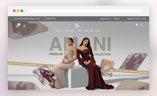
A Salla store, not a Salla homepage
A shopper meets your store one screen at a time. These are the screens that carry them to the payment page.
The full purchase path
Homepage, category and collection pages, product page, cart and checkout — designed as one continuous flow rather than six separate pictures.
Salla-native structure
Built around how Salla actually assembles a page, so the design does not have to be compromised to go live.
Arabic RTL from the start
Mirrored layouts, Arabic numerals in the right places, and forms that stay in Arabic all the way down.
Mobile first
The phone layout is drawn first, because that is where nearly every Gulf shopper arrives.
The screens most stores skip
Empty search results, out of stock, order confirmation — the quiet moments where a shopper decides whether to trust you.
A handover you can publish
Source files, exports and the spacing and type rules, so the published store matches what you approved.
Four stages, and you see the work at each one
Structure is agreed before any visual design starts, so nothing is a surprise at the end.
Discovery
Your products, your buyers, and what your current store gets wrong — before a single screen is drawn.
Structure
Wireframes for each page type, reviewed with you, so the shape of the store is settled first.
Design
The visual layer applied across every template, Arabic first, mobile first.
Handover
Files organised for Salla, plus the rules a developer needs so the live store matches the design.
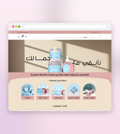
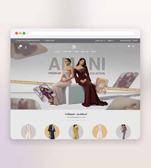
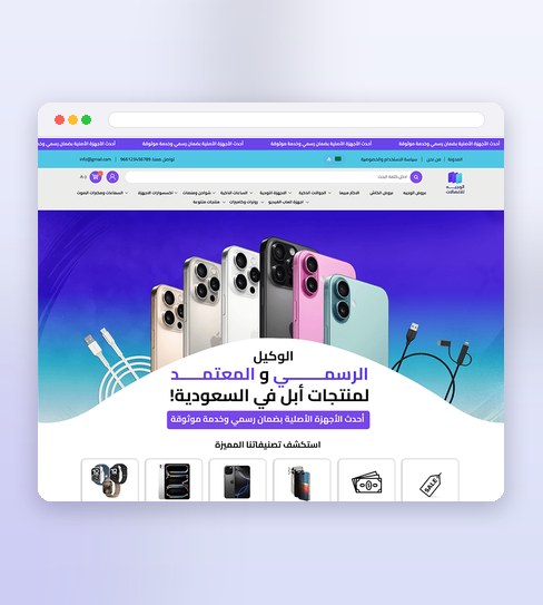
Storefronts I have designed
The practical details
Every project is quoted after we talk. See how packages are put together.
What actually decides whether a Salla store sells
Salla stores fail at the same four screens
After enough storefronts you stop seeing a thousand different problems and start seeing four, over and over. The category page that dumps sixty products into one undifferentiated grid. The product page that buries the single fact a buyer needed. The cart that hands a shopper a reason to stop and think. And the mobile header that eats a third of the screen before anything has been sold.
None of those are visual problems, which is why a prettier theme does not fix them. They are decisions about what a shopper needs to know and in what order, and they get made whether or not anyone makes them deliberately. Designing a Salla store means making them on purpose.
Why the platform has to shape the design
A Salla store is assembled from the platform’s own components. A design drawn without knowing them looks complete in a presentation and then loses a piece at every step of the build: spacing that cannot be set, a layout the product grid will not take, a filter that does not exist. What gets published is the compromise, and nobody planned it.
Drawing inside the platform is not a limitation, it is what makes the approved design and the live store the same thing. The constraints are known up front, so the effort goes into the decisions that are genuinely free: hierarchy, sequence, typography, and what earns space above the fold.
Arabic is the layout, not a translation of one
Most Arabic storefronts are English layouts turned around, and it shows in the details. Numerals in the wrong script. Icons pointing the wrong way. A form that begins in Arabic and finishes in English. Line lengths tuned for a Latin face, leaving Arabic text cramped.
Arabic letterforms connect, sit differently on the baseline, and need more line height to stay readable at small sizes. Drawing the Arabic layout first lets those needs shape the grid instead of being squeezed into one built for something else. When the store also needs English, that version is built outward from the Arabic, which is the easier direction to work in.
The phone is the store
Nearly every shopper in the Gulf arrives on a phone, often on mobile data, usually with one thumb. A design reviewed on a laptop and then shrunk will always be a desktop store that a phone can open.
Drawing the phone layout first forces the real question early: of everything on this screen, what earns its place? That question is what stops a product page from growing into six scrolls of badges before the price.
What happens after handover
A design a developer cannot build exactly is a design that will be approximated. The handover carries the source files, every export, and the rules underneath them: the spacing scale, the type sizes, how each component behaves at every breakpoint, and what the empty and error states look like.
That is the difference between a store that matches what you approved and one that merely resembles it. On Salla the setup can be done directly; on other platforms the files are written for whoever builds it, and questions during the build are part of the work rather than an extra.
About Salla specifically
Do you design Salla themes or customise an existing one?
Can you set the store up on Salla, or only design it?
Salla or Zid — which should I pick?
I already have a Salla store. Can you redesign it?
Will the Arabic version look like a translated English store?
How much does a Salla store design cost?
Do I need a brand identity before the store?
Who writes the product descriptions and takes the photos?
What if I already have a designer and only need part of this?
Related pages
Other platforms, and the markets I work in.