


Beaut Center
Beaut Center sells one thing: an appointment. So the page was built around a single offer and a single booking path, rather than the usual spa-site instinct to list every treatment, every price and every promotion on one screen. Everything that didn't move a visitor toward booking was cut before the page was designed, not after.
The tone had to match a women's spa in Riyadh specifically — warm and private rather than clinical, with enough restraint that the imagery and copy do the persuading instead of banners and countdown timers. One clear promise, repeated calmly, reads as more confident than five competing offers ever could.
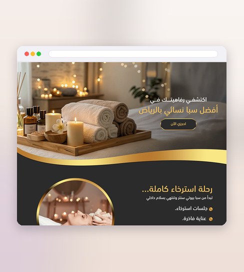
What the design delivers
The decisions that carry this project.
One promise, one page
A single offer, stated once, with nothing to distract from it.
Straight to booking
The path from interest to a booked slot stays short.
Built for the ad click
Everything above the fold earns the next tap.
One offer, said once, said well
No menu of services competing for attention — three pieces carry the whole page.
A single, unmistakable offer
The one promise the spa is making sits in the first screen with nothing beside it fighting for the same attention.
One booking path, repeated
Every section leads to the same action, so a visitor is never asked to choose between competing calls to action.
A tone built for trust, not urgency
Calm imagery and restrained copy instead of banners and countdown timers, because a spa earns bookings through confidence, not pressure.
Four stages, one offer kept intact
Every choice was tested against whether it protected the single promise or diluted it.
Discovery
I started with the one offer the spa actually wanted to sell, and cut every other treatment and promotion that would have competed with it on the page.
Wireframing
The page was structured around a single scroll toward one booking action, with no secondary paths or menus splitting attention along the way.
Visual Design
Imagery and colour were kept warm and understated, so the page reads as private and trustworthy rather than like a sale.
Execute
Delivered as a complete page design — every section, state and call to action — ready to build exactly as tested.
Project details
Considering a single-offer landing page for your own business? See the Landing Page Design service.
Before a single-offer landing page
Why build around one offer instead of listing the spa's full treatment menu?
How was the tone kept private rather than sales-y?
Does a single-offer structure work for businesses with more than one service?
Like what you see?
Tell me about your store and I’ll show you what it could look like.