


Art Zone
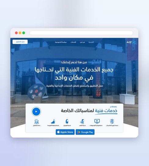
Art Zone connects people with home-service providers — cleaning, maintenance, repairs — and the page has one job: get the visitor to open an app-store link with enough confidence to actually do it. That means naming the exact services in the first screen rather than describing the app in the abstract, because someone comparing a handful of apps just wants to know if their specific problem is covered.
Trust does the rest of the work. Letting a stranger into your home is a bigger ask than most app installs, so the credibility markers — ratings, provider numbers, how bookings are verified — sit close to the fold instead of being buried lower down, and the whole layout stays short enough that the App Store and Google Play buttons are never more than a scroll away.
What the design delivers
The decisions that carry this project.
Categories at a glance
Services are laid out so the right one is found fast.
Credibility up front
Proof and reassurance sit before the ask.
Straight to the app
A direct route to the store, with nothing in the way.
A page built for one tap
Three pieces do the convincing before the app-store buttons ever appear.
Service categories at a glance
The exact services Art Zone covers — cleaning, repairs, maintenance — shown as recognizable categories in the first screen, not a wall of app-feature copy.
Credibility that's visible early
Ratings, provider numbers and how bookings are verified sit close to the fold, so trust is established before anyone scrolls looking for it.
A direct route to both app stores
Every section leads back to the same two buttons, App Store and Google Play, so the page never leaves a visitor wondering what to do next.
Four stages built around one action
Nothing goes into a section unless it moves someone closer to installing.
Discovery
I mapped what Art Zone actually offers and who opens a home-services app under real pressure — often mid-emergency — to decide what the first screen has to answer immediately.
Wireframing
Sections were ordered by how much convincing they add: services first, credibility second, everything else after — tested as a scroll sequence before a single pixel was styled.
Visual Design
Colour, icons and category art were kept simple enough to read at a glance on a phone, since most of this page gets opened on the go, not at a desk.
Execute
The page was delivered as a full design with every section, state and call to action ready to build, so the install path stayed exactly as tested.
Project details
Planning a similar landing page for an app or service business? See the Landing Page Design service.
Before you build a service-app landing page
Why does the page lead with service categories instead of an app description?
What's included if I need a similar landing page for an app or service business?
Could this same approach work for a service business that isn't an app?
Like what you see?
Tell me about your store and I’ll show you what it could look like.