


Cidea Store
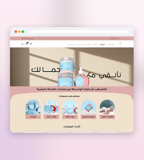
Cidea sells beauty devices — things people research before buying, not impulse items — so the product page had to lead with function: what the device does, which skin concern it addresses, how it's used, before it ever gets to lifestyle photography. A shopper comparing devices across tabs needs the facts to be findable in seconds, not buried under mood shots.
The rest of the store was built to support that same decision-making: category and collection pages that let people narrow by concern rather than just browse, and a cart and checkout built to survive comparison shopping without losing the sale — including the empty and error states most stores skip until something breaks.

What the design delivers
The decisions that carry this project.
Specs that make sense
Each device leads with what it does, in plain language.
Confidence to buy tech
Technical detail is framed so a first-time buyer isn’t lost.
A page that answers
The product page covers the questions a shop assistant would.
A storefront built around the spec sheet
Three pieces carry a shopper from comparing devices to checking out.
Product pages that lead with function
What each device does and which concern it treats sits above the lifestyle photography, because that's the information a comparison shopper is actually hunting for.
Category pages built to narrow by concern
Devices are filtered the way people actually shop for them — by what they treat — rather than by a generic product grid.
A cart and checkout that hold under scrutiny
Every state, including empty carts and errors, was designed rather than left to a default, so the path to purchase never breaks mid-comparison.
Four stages built around comparison shopping
Every screen was tested against how someone actually decides between two devices.
Discovery
I looked at how people actually shop for beauty devices — specs open in one tab, reviews in another — to decide what the product page had to answer first.
Wireframing
Category and product page structures were wireframed around narrowing by skin concern, not just browsing a catalogue.
Visual Design
Function-first product pages were paired with clean, consistent photography, so the store still felt considered without slowing down the comparison.
Execute
The full storefront — homepage through checkout, including empty and error states — was delivered ready to build for desktop and mobile.
Project details
Building a product-led storefront of your own? See the E-commerce Store Design service.
Before a spec-led storefront
Why do the product pages lead with specs instead of lifestyle photography?
What's included in a storefront design like this one?
Does the filter-by-concern structure apply outside of beauty devices?

Like what you see?
Tell me about your store and I’ll show you what it could look like.