


Gamalak
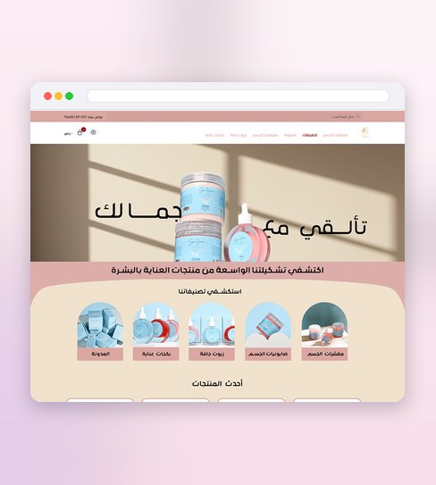
Gamalak sells skincare, and its customers arrive almost entirely on a phone — mid-scroll, often mid-routine research. So the store was designed mobile-first from the very first frame: every template drawn for a small screen before it was ever stretched to a desktop one, not the usual habit of designing wide and shrinking down later.
Skincare is bought by concern and skin type as much as by product name, so browsing leans on that — product photography that shows texture and finish, and a path from "what does my skin need" to checkout that stays short on a thumb-sized screen. Cart and checkout carry the same restraint, since a slow last step is where mobile shoppers drop off.
What the design delivers
The decisions that carry this project.
Mobile first, for real
Designed on the phone, where nearly every customer arrives.
A thumb-friendly path
From “what does my skin need” to checkout in a few taps.
Considered, not clinical
A calm, expert tone that suits the category.
A store that works with one thumb
Mobile is not an afterthought here — it's the first draft. These three pieces are what that discipline produces.
Mobile-first templates
Every screen was drawn at phone width first and proven there, then scaled up to desktop — never the other way round.
Browsing by skin concern
Category and product pages lean on how skincare actually gets chosen — by concern and skin type, not just a product name.
Full screens, edge cases included
The complete desktop and mobile set, plus the empty and error states a real store runs into.
Designed small first, proven there, then scaled up
The mobile screen is the primary canvas here, not a shrunk copy of the desktop one.
Discovery
A look at how Gamalak's customers actually shop — almost all of them on a phone, often comparing a routine rather than a single product.
Mobile wireframes
Every template is laid out at phone width first, where thumb reach and load time set the real constraints.
Prototyping & testing
Screens are checked one-handed, scrolling included, before anything is scaled up to a desktop layout.
Visual design & handover
The desktop version is built from the proven mobile one, then the full set — desktop and mobile — is handed over.
Project details
Selling to a mostly-mobile audience of your own? See the E-commerce Store Design service.
Before we design mobile-first
Why design mobile-first instead of adapting a desktop layout down?
What's included in a store design like this?
Does browsing by skin concern work for other beauty or wellness stores?

Like what you see?
Tell me about your store and I’ll show you what it could look like.