


Vitaroot
Vitaroot sells supplements, and supplement shoppers hesitate for a specific reason: they want to know the product is licensed and they want to know exactly how much to take, before they buy. The store was rebuilt around answering both up front — licence and certification badges placed where trust actually gets decided, not buried in a footer, and dosage information written in plain terms next to the product itself.
The product page was rebuilt around that same idea: dosage and licence information sit next to the price, not behind a tab, so a shopper doesn't have to leave mid-purchase to go and check. The rest of the store — grid, filters, cart — was drawn to carry that same clarity through to checkout.
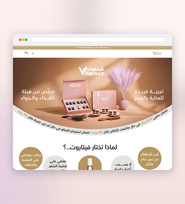
What the design delivers
The decisions that carry this project.
Trust made visible
Licence and quality badges sit exactly where doubt usually starts.
Answers before the click
Dosage and usage are spelled out on the page, not buried a tab away.
Built to reassure
Every product block is shaped to settle the buyer’s last question.
Trust, built into the product page
Three pieces that let a supplement shopper buy without leaving to double-check something first.
Licence and certification badges
Placed where trust actually gets decided — next to the product, not in the footer — so credibility doesn't depend on a shopper going looking for it.
Dosage clarity, not a data sheet
Serving size, frequency and what it's actually for are written in plain terms next to the price, answering the question before it gets asked.
A component library for every state
Grid, filters and cart carry the same clarity as the product page, so trust built on one screen doesn't have to be rebuilt on the next.
Four stages built around one question
At every stage: what does a hesitant shopper need to see before they'll trust this enough to buy.
Discovery
I look at where supplement shoppers actually hesitate — licensing, dosage, side effects — and at how competitors bury or surface that same information.
Wireframing
The product page is structured around the trust-deciding information first, so licence and dosage details have a real place before any visual styling is applied.
Visual Design
Badges, typography and layout are tuned so the trust signals read at a glance, without turning the page into a wall of disclaimers.
Handover
Full screen set, every interactive state and a component library are delivered together, so the clarity holds across the entire store, not just the product page.
Project details
Selling something a shopper needs to trust before they'll buy? See the UI/UX Design service.
Before you scope a store like this
Why put licence badges next to the product instead of in the footer?
Isn't putting dosage information up front just adding more text to the page?
Would this trust-first approach suit other regulated or health-adjacent products?

Like what you see?
Tell me about your store and I’ll show you what it could look like.