

Jawhara
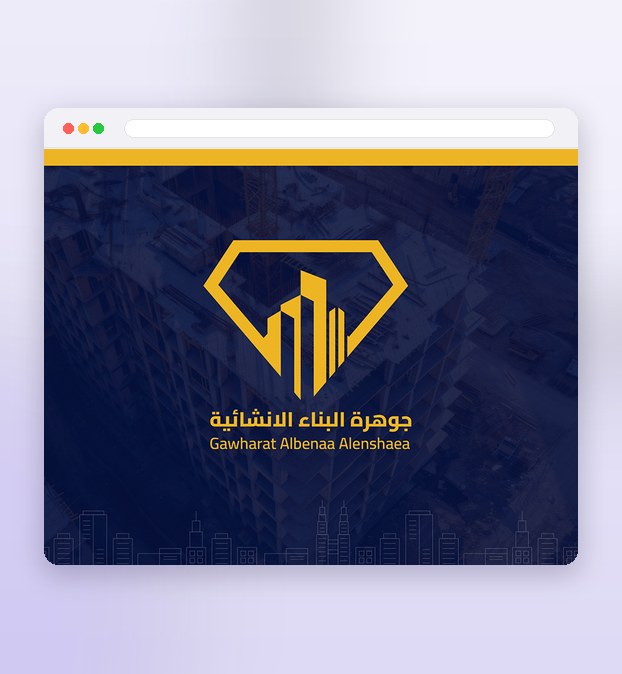
Jawhara is a construction company, and its mark had to survive two places that could hardly be less alike: a hoarding wrapped around a building site and read from across the street, and a business card held at arm's length. So the monogram was drawn as one closed outline with no fine detail to lose — a diamond whose facets are cut from the silhouettes of towers under construction, putting solidity and value into the same shape.
The palette is gold on deep navy, chosen for weight and permanence rather than fashion. Navy holds up behind site photography and stays readable everywhere a construction brand actually ends up — signage, a vehicle, a hard hat, a tender document — and the gold gives the mark its value without any of it depending on trend. The Arabic and Latin lockups were drawn alongside each other rather than one after the other, so جوهرة البناء الإنشائية and Gawharat Albenaa Alenshaea carry the same optical weight and neither reads as an afterthought.
From the mark comes the system that carries it: stationery, letterhead and cards, document and print templates, and the rules for how the monogram sits on a dark ground and how much clear space it needs. All of it is built to be reproduced by other people — a printer, a sign maker, an office — without the mark drifting.
What the design delivers
The decisions that carry this project.
One mark, one system
The diamond-and-tower monogram drives stationery, cards, signage and site from a single idea.
Arabic and Latin, matched
Both scripts are drawn to the same weight, so neither reads as a translation of the other.
Legible at any size
It holds its shape from a business card to a building hoarding.
A system, not just a mark
The monogram is the start — here's the system that carries it everywhere the brand has to show up.
The diamond-and-tower monogram
One closed outline with no fine detail to lose — legible from across a street and at business-card scale alike.
Matched Arabic and Latin lockups
جوهرة البناء الإنشائية and Gawharat Albenaa Alenshaea drawn alongside each other, carrying the same optical weight.
The print system
Stationery, letterhead, cards and document templates, plus the clear-space and minimum-size rules that keep the mark from drifting.
Four stages, from sketch to site
Nothing is drawn in full colour before the shape survives at thumbnail size.
Discovery
I start with the company and every place its name will physically appear — hoardings, vehicles, signage, stationery and tender documents — and how other contractors in the market present themselves.
Sketching
The mark is sketched by hand first and judged at thumbnail size, because a monogram that holds together small will hold together everywhere else.
Proofing
The chosen mark is proofed where it has to live — shrunk to a card, blown up to hoarding scale, reversed out of navy, printed in a single colour. Anything that breaks is redrawn.
Handover
Files are delivered ready to produce — the logo in the formats a printer or sign maker needs, colour references, and the spacing rules that keep the mark consistent wherever it's used.
Project details
Curious what a mark like this would take for your own company? See the Brand Identity & Logo service.
Before you commission a mark like this
Why one closed outline instead of a more detailed crest?
What's included when a brand identity like Jawhara's is handed over?
Could this approach work for a different industry?
Like what you see?
Tell me about your store and I’ll show you what it could look like.